Should Corporate Branding Colour your Thinking?
Posted on September 15, 2016 at 12:30 PM
At Bags of Ideas, we’ve been supplying branded promotional products to both large and small businesses for more than 30 years now and the message is finally getting through to marketing departments; effective branded merchandise needs some room to breathe.
An overly-strict adherence to a business’s brand management policy can damage the impact of fashion-related branded merchandise, be it travel mugs, pens and pencils or a USB flashdrive.
This is even more important when dealing with items like promotional bags or any product with a large advertising surface, such as a golf umbrella.
In both these cases, what the item actually is says something about the person who is either wearing or holding it for everyone to see.
For example, if the base colour is dull and muddy, what might that be saying about the bearer?
Colour is important, regardless of branding restrictions, and there are countless creative opportunities to quickly make your corporate logo stand out from the crowd.
Any business wants their brand or identity on the promotional product to be as visible as possible, to stand out from the crowd and be seen and communicate a positive message. And colour is key to achieving this goal.
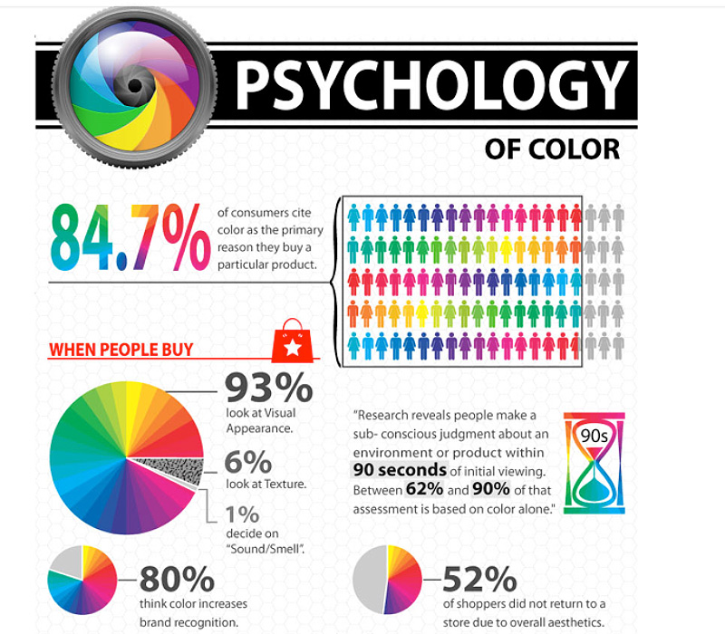
As this graphic shows, the Psychology of Colour plays an important part in consumers’ day-to-day buying decisions. Only 7% of people buy without considering the appearance of a product and up to 90% of the decision is based on colour alone.
This one’s a keeper
Although promotional company merchandise is given away free, the chances of the receiver holding on to it and continuing to use it or wear it – in the case of clothing – in the months or weeks ahead, depends primarily on its attractiveness.
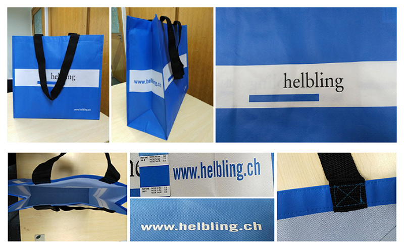
In examples given here the company logo itself provides minimal opportunities for effective branding and promotion, but with the appropriate and effective use of colour, focus and attention is drawn to the company name and website address.
The non-woven PP “bag for life”, with long robust handles, clearly communicates the company’s values and identity in a fashionable way, without compromising on those all important brand values and corporate guidelines.
The added value that a trusted promotional bag specialist like Bags of Ideas offers over and above an appreciation of brand values, is to translate those values into an effective and attractively designed bag, whether it be a lightweight carrier bag, or a drawstring, laptop or sports bag.
Rules are made to be bent
It’s how you apply the rules that’s the big question. For some successful international brands, colour and brand name have to co-exist at all times
Examples include those where colour dictates the brand identity, such as Easyjet orange, Subway green, UPS brown, Cadbury’s purple and Starbuck’s Emerald.
The base colours are so powerful in identifying brand ownership that it would be disastrous to introduce others.
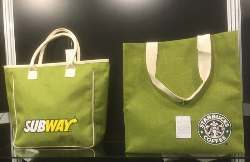
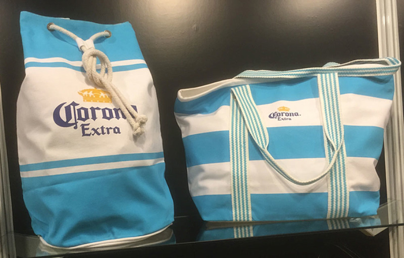
Both Subway and Starbucks employed promotional bags in an appropriate tone of green and managed to maintain the integrity of the brand in gift items. Both canvas bags are attractive fashion items with sufficient branding to gain attention when used and reinforce brand values and customer loyalty.
Fortunately, many brands and companies now have greater flexibility in policies on brand colour usage without damaging brand integrity, allowing them to use a collection of colours.
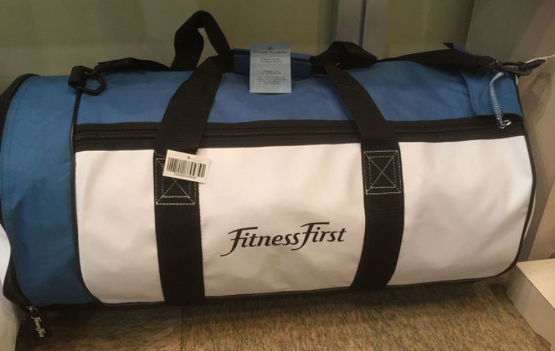
This Fitness First bag introduces a non-corporate colour with the blue nylon material surround to once again provide an optimum focal point for the brand name on a white background. Obviously, this would work well with other colours such as pink or purple.
Of course, promotional products – and especially promotional bags – are all about getting your logo or message seen.
Hogging the limelight
Whether you are at a conference or exhibiting at a professional trade show and want visitors to promote your brand on an eco-friendly jute or canvass conference bag, or on a printed cotton shopper or backpack used for a weekend retreat, the colour will be the first thing that grabs people’s attention.
This brings me to my key point: all bags, whether they be branded cotton shoppers, tote bags, sports holdalls or weekender bags, must have an appeal to the user, otherwise they won’t be used. People can look a gift horse in the mouth, after all
The fact is that if this means using a different colour to the corporate hue to promote the brand, then so be it.
I have daughters who need backpacks for school and when I suggested that I could get hold of a quality promotional backpack, they just weren’t interested … unless they liked the colour.
After all, a backpack is a fashion item and an extension of their personality and vision.
We all make choices everyday on what we like and don’t like so colour dictates decisions, and whether the promotional bag is a basic paper bag or even a plastic bag, its colour will be the first thing that will determine whether to use it or not.
Once colour options have been identified, a multitude of choices open up to create a fashionable and functional promotional bag which will attract consumers of the brand and reinforce the brand qualities with a touch of class.
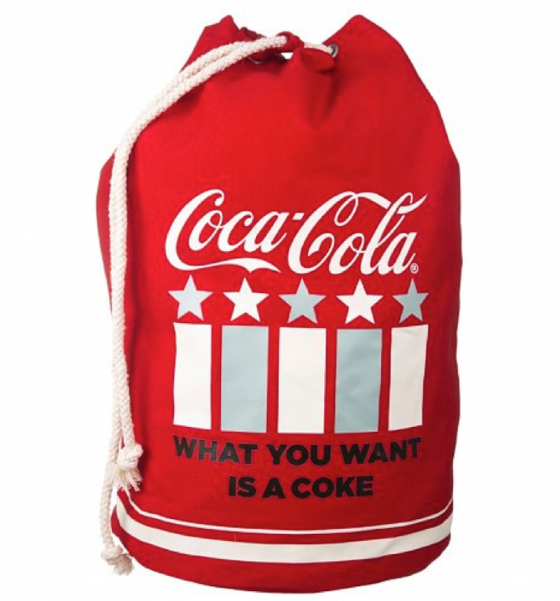
Making the world see red
The ultimate success story is to have branded merchandise that people want to buy because of the strength of the brand.
There is no doubt that a brand does not get much bigger than Coca Cola.
There are even stories told that Coca Cola gave us the red and white Christmas colour combination we have today. While it’s true that at the beginning of the 1930s the nascent Coca-Cola company turned to a talented commercial illustrator named Haddon Sundblom, who created a series of memorable that associated the brand with a larger than life, red-and-white garbed Santa Claus.
But as is detailed on the Snopes.com myth-debunking site, images of extravagantly-bearded Santas clothed in red suits and red hats with white fur trimming, held together with broad black belts, were common long before Coke’s first Santa ad in 1931.
Despite this sobering reality, the fact that the myth still persists is testament to the awesome power of colour in brand identity.